


After a few months, I decided to go back to this project and re-assess my idea of how this infographic should be represented. I went back in and reworked it so the its illustrative properties would read more clearly. While I was working on the project, I thought that despite the fact that it was more abstract, it looked visually appealing. However, when I stepped away from it, I realized that it was still hitting a wall of not making too much sense.
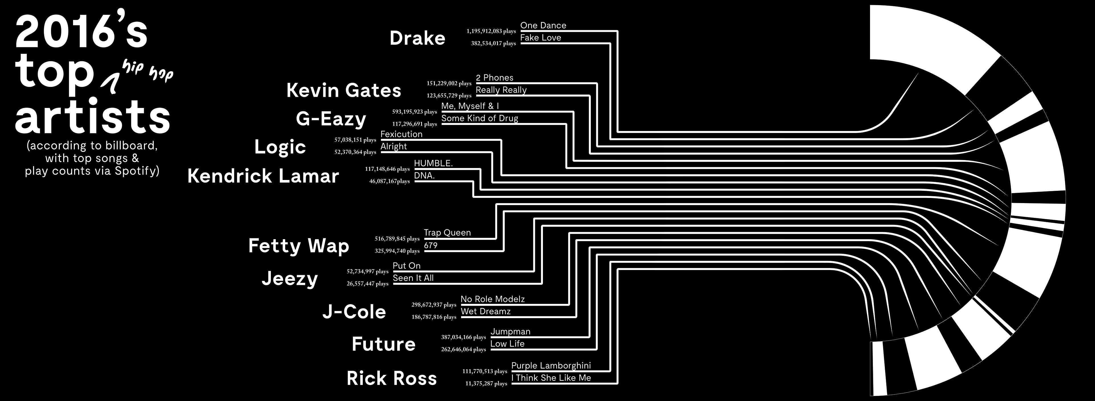
After a while of letting this project sit, I decided to come back to it and use my motion design skills to make the infographic more dynamic. Instead of arbitrary spaces, I used spinning records to indicate 10,000,000 plays. As always, there are more tweaks that I want to do to make sure that everything is timed perfectly. For now, however, here is the (mostly) final product.