
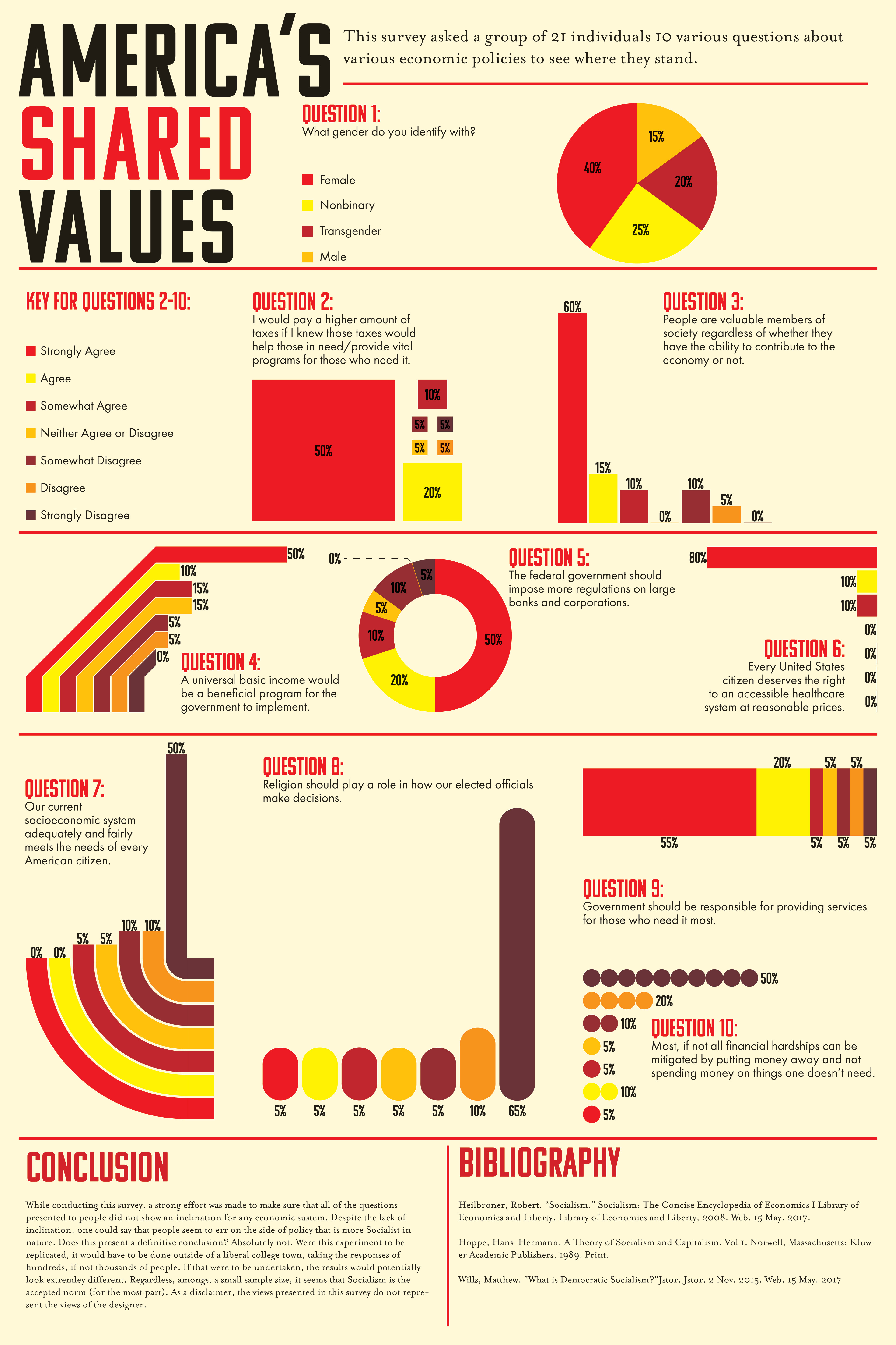
This second poster was created after the semester had ended and I had a bit more time on my hands to think things out throughly. For this version, I took ten of the best questions I asked and represented them in more creative ways, allowing each graph to take up more space, while also reducing visual clutter. I reworked my conclusion so that it was less awkward, and I changed the name of the project to be more neutral.

Some of the problems that came up while making this initial poster was the simple fact that there was far too many pieces of information to be putting on a poster of this size. Fact of the matter was that all of the information collected was far too much to be placed on the poster, and it shows. Part of the revision process was deciding what read well and what wasn't entirely necessary, and subsequently designing a second poster based on those findings. However, despite the fact that the first poster is a bit of a mess, the fact that I was able to go from information gathering to final product for the first time while producing results like this was a good exercise in what to do and what not to do when creating infographics.